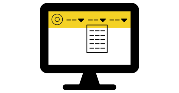
Desktop Navigation Bar
An expanded menu in the website header to improve navigation.

Last Updated: 19/03/2024 - This feature is now live for everyone 🎉
You can find the original feature proposal below, and if you have ideas for improvements please do leave a comment.
Background
The DEAL Community Platform was designed with a mobile-first perspective in mind, partly based on the expectation that most users would accessing the site on a mobile device (as is becoming increasingly common across many websites).
However, the majority of people (around 60%), visit this site on a high-resolution desktop or laptop. In light of this, certain design decisions may warrant revisiting or expanding. Notably the collapsible menu which is hidden until a user clicks on the "hamburger" icon (three horizontal lines).
Furthermore, the current header bar is mostly empty (containing only the DEAL logo, profile picture and "hamburger" menu icon) doesn't provide a lot of value in return for the screen space that it takes up.
What is the essence of this suggestion/idea?
Create a new navigation bar / menu for high resolution displays that replaces the current header at the top of the page. This would list high-level categories that could then be clicked on to expand and show relevant links.
Here is an example mock-up (also integrating the feature proposals for a Global Search bar and Notification System icon):

The collapsible "hamburger" menu would remain in place for mobile and other lower resolution devices that cannot display the full menu. There could also be partial versions at "middle" resolutions where, e.g. the search bar is removed to make room for the menu items.
What are the potential benefits of this suggestion/idea?
A new navigation bar could help to visually show how the site is structured at a glance, which should improve discoverability and clarify which content is available and where it can be found.
Who would benefit from this suggestion/idea?
The majority of users who visit the site using a laptop or desktop computer, especially new users looking to discover different parts of the site.
Open Questions
- What should the high-level categories on the menu be?
- Are there any parts of the site that could do with additional exposure?
- On smaller devices, which elements (menu items, search bar, notifications, profile icon) should take priority?


