Version 3.0 (January 2024)
Overview
This tool provides a set of materials to explore national Doughnuts, including an introductory video (with presentation slides available to download), an interactive data visualisation that lets you select and compare the environmental and social performance of nearly 150 nations since the early 1990s, and additional ideas for exploring the results.
The methods and results underpinning the data used in this tool have been peer-reviewed. Please cite the following scientific journal article if using these results publicly:
Fanning, A.L., O’Neill, D.W., Hickel, J., and Roux, N. (2022). The social shortfall and ecological overshoot of nations. Nature Sustainability 5(1), pp 26-36. https://doi.org/10.1038/s41893-021-00799-z. (available to read open-access here).
Downscaling the Doughnut to nations: video and slides
In this 16-min video, Andrew Fanning (DEAL Research & Data Analysis Lead) introduces research he led on how countries perform with respect to the Doughnut’s social and ecological boundaries, and presents an interactive website where users can explore national Doughnut data and charts for 150 countries.
This content is hosted by a third party: YouTube (www.youtube.com). By clicking 'Show content' you confirm that you have read and agree to their Terms of service.
By clicking below you also consent to the creation of a cookie so we can remember your choice for one month. See our Privacy Notice for our full cookie policy.
The video was recorded in September 2023 as part of this series of videos presenting Doughnut Economics concepts and practice. You can access Andrew's presentation online using Google slides, or download the PowerPoint presentation.
National Doughnuts Data Explorer
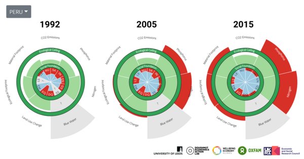
Select a country from the dropdown menu below to view its performance relative to the Doughnut of social and planetary boundaries and see how it changes over time. You can also see the trajectories of the individual biophysical and social indicators (below the Doughnut), and download the data for the selected country.
This content is hosted by a third party: Observable (observablehq.com). By clicking 'Show content' you confirm that you have read and agree to their Terms of service.
By clicking below you also consent to the creation of a cookie so we can remember your choice for one month. See our Privacy Notice for our full cookie policy.
Additional information and ideas for exploring the data
For additional information and many more doughnut-inspired data visualisations, or if you would like to download and use the full dataset, please visit this external website hosted by the University of Leeds:
Open the ‘Good Life For All Within Planetary Boundaries’ interactive website
The purpose of this interactive website is to foster and inform public discussion about the meaning of a “good life” and what it could look like in a world that lives within planetary boundaries. This discussion is vital – and urgent – because the results show that no country currently meets basic needs for its residents at a globally sustainable level of resource use.
Here are a few ideas to dive into this interactive website (on your own, in a group, or a classroom):
- How does your country do with respect to living within the Doughnut?
- Visit the 'Country Trends' page and select a country of your choice. Consider why you think it performs as shown, and where you think it’s going next. Compare with other countries.
- Do you see any patterns across countries in terms of how they perform on the social and ecological dimensions of the Doughnut?
- Consider the 'bubble chart' on the 'Pathways' page, and ask where would the Doughnut's 'safe and just space' be on this chart? Can you identify broad pathways towards the Doughnut for different nations?
- What are the interconnections between countries?
- No country is an island – they are inextricably linked and interdependent through trade, migration, colonial legacy, and many other ways. Can you think of how to show these interconnections, and explore whether they can be transformed to bring all countries within the Doughnut?
Acknowledgements
This tool was created by Andrew Fanning. The National Doughnut Data Explorer shown above is part of an interactive website resulting from a collaboration between Andrew Fanning at DEAL and the University of Leeds, Dan O’Neill at the University of Leeds, Kate Raworth at DEAL, Katherine Trebeck at the Wellbeing Economy Alliance, Jason Hickel at the Autonomous University of Barcelona, William Lamb at MCC, Julia Steinberger at the University of Lausanne, Beth Stratford at the University of Leeds, and Nicolas Roux at BOKU Vienna. The time-series national doughnut data visualisations were created by Rafael Gutiérrez Martínez at Codigo Visual and Andrew Fanning. Funding was generously provided by the Leeds Social Sciences Institute ESRC Impact Acceleration Account, Research England’s QR Strategic Priorities Fund, and with additional in-kind contributions from each of the participating institutions listed above.


David Brühlmeier
Düdingen, Fribourg/Freiburg, Schweiz
Building bridges for a more beautiful world our hearts know is possible.