Version 1.0 ([October 2020])
Overview
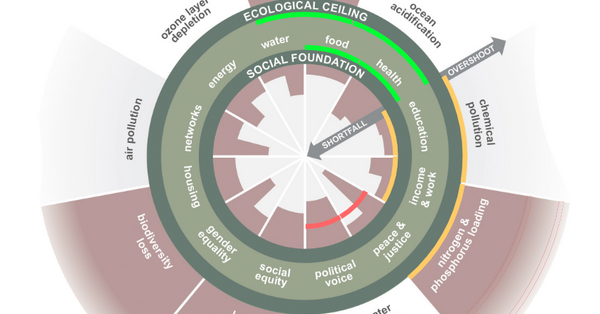
This is a visualisation tool, to quickly draw arcs into the doughnut diagram. Thick and thin arcs can be drawn, over the various topics of the doughnut. Furthermore, the arcs are in colour, representing a level: green is good, through to red which is bad.
Why use it?
This is a way of quickly summarising a situation. Thick arcs can represent the current situation, and thin can represent the targets that want to be achieved.
Who is it for?
Anyone who wishes to present a situation on the doughnut diagram. Therefore suitable for facilitators, teachers, students, policymakers, entrepreneurs, consultants etc. It is also useful as a working tool, to create snapshots.
How long does it take?
It is immediate to use: click on the relevant level (1 to 5) of a topic (e.g. Land Conversion), and an arc is drawn on the diagram. Once done, a record can be made by taking a screenshot.
How many people is it for?
Any number of users at any time.
What materials do you need?
None, only access to the website.
What does the facilitator need to know or be able to do?
To be familiar with the buttons, that thick and thin lines can be drawn, as well as erased. No data is stored or collected (it is all done via the website page scripting); there is no possibility to download the image. However, as screenshot is possible. On the page, there is a further link to a pdf that may help in selecting a appropriate level (1-5). This data is set out as a grid for reference, but the original data is from the book Doughnut Economics.
Acknowledgements
Thomas Rasche created the tool. The original image of the doughnut, adapted to be a greyscale from Kate Raworth.
Links


William Banner
Malvern, England, United Kingdom
I love Doughnut Economics Theory and I am working on a doughnut model for the city of Worcester, UK.